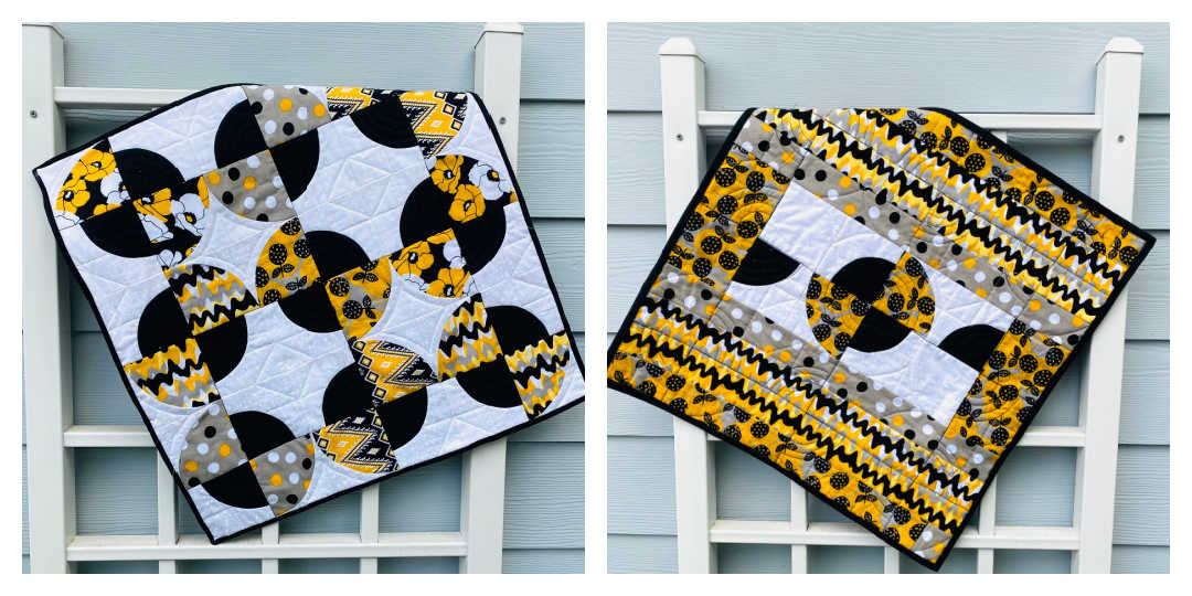
Last year, Pantone released two colors for 2021, and we started off our year with the Pantone Challenge where we created a quilt using both these tones of yellows and grays. Together, we created so many beautiful projects! I loved working with these tones, as well as the quilt that resulted. It was such a great opportunity to practice circles, too!
This year, Pantone’s color is PANTONE 17-3938 Very Peri: A new Pantone color “whose courageous presence encourages personal inventiveness And creativity.”
…that’s a lot of insight into one color, no? 😉
I honestly am so excited that this is the color of the year! Do you notice the second photo below? I see some lovely rose colors in there, which are honestly so perfect for the third week of Advent and Lent. Haha – it’s a liturgical dream color choice!
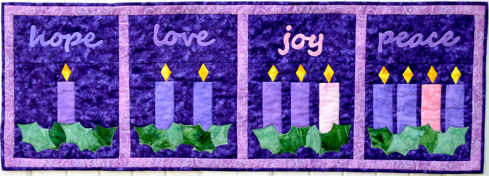
I’ve been wanting to redo the Advent Wreaths quilt that I have from a few years ago, so this might just be the perfect opportunity to redo it in these periwinkle tones. They’re so close to purple, but fall a bit more on the blue side which – if you’ve seen my home – is perfectly ok with me. Here’s my table runner that we’ve had for a few years now…can’t you imagine it in low volume periwinkle hues? Love!
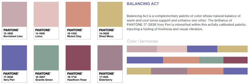
Pantone offers a complimentary palette exploration tool, which lets you play around with color choices to find those that harmonize. I think when I redo the Advent Wreaths quilt, I’m going to do it in these colors shown below. I love the Veri Peri and Elderberry for the purple candles, and the Hawthorn Rose for the rose candles. I imagine the background done in Lotus…but wouldn’t the Dried Moss make a beautiful color pop? If I don’t go with the Dried Moss for the background, I imagine using it on the leaves along with the Granite Green. So many possibilities!
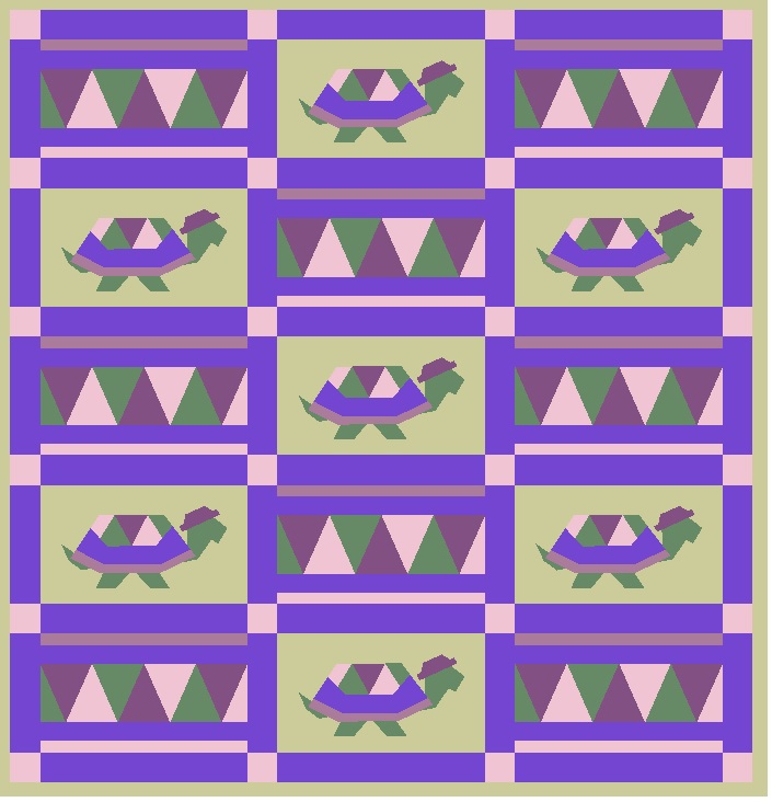
If you can handle the starkness of a digital mockup, I even played with a similar version of these colors in our Tommy the Tortoise quilt. I really like the way the colors come together, don’t you? They all have a bit of that dusty undertone. I couldn’t get the colors to be an exact match to the pantone ones (my quilting software only goes *so* far!), but it’s a good approximation, and I imagine it would be even more lovely with the actual colors. I’m hoping to make this quilt this summer for a friend who is expecting her third little girl, and the color palette is just perfect for that.
So tell me…what do you think of the 2022 Pantone Color of the Year? Leave me a comment below!


Leave a Reply