Welcome to TGIFF (Thank Goodness it’s Finished Friday) at Faith and Fabric! My name is Jen Frost, and I’m the Christian quilt pattern and fabric designer behind our signature Scripture Quilts ™ and Scripture Quilts Blocks™. I love sewing my faith and diving into the deeper meaning of scripture as we create! For real – one of my favorite ways to combine my love of sewing and faith is our Free Motion Friday series, where we learn a new free motion quilting design inspired by scripture.
Today we’re going to talk about choosing colors for quilt binding. I have this beautiful Our Lady of Guadalupe quilt that is done – pieced, sandwiched, and quilted, and all it needs is binding. Simple enough to choose a color and get on with it, right? In my case…not so much. I’ve had this quilt “done” for months now, sitting here, waiting for a binding. My challenge? I couldn’t figure out what color to use for the binding! So, let’s talk about color – and how I finally decided on red to be the color of choice for this quilt for this week’s TGIFF.
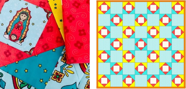
First, a brief introduction. A while back, I wanted to try my hand at designing fabrics that were intended to be fussy cut. I used Our Lady of Guadalupe as the theme, and created these five fabrics, each inspired by her story:
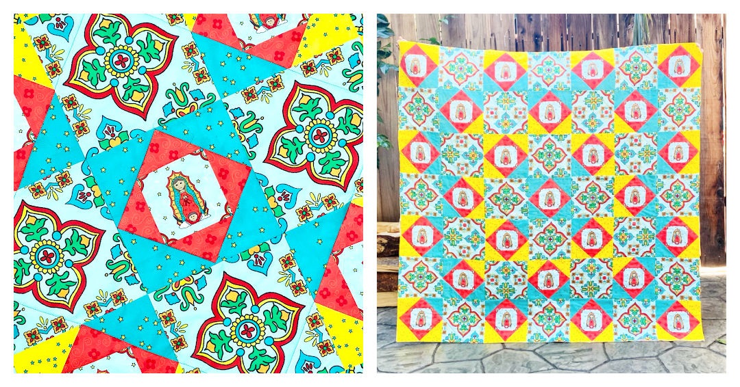
The quilt came together beautifully; I’m so happy with the overall effect! Depending on how I cut the main patterned fabric made created the coolest effect in the quilt, as shown below. That said…once it was sewn, it was put on The Shelf of Unfinished Projects (said in an ominous voice) as I just couldn’t decide on a color for the binding. With TGIFF here, though, it was time – so I sat down determined to select the perfect color. Here’s the process I went through in determining:
- Use a Color that is Used Sparingly in Your Quilt Binding
In my quilt, there are little bits of orange in Our Lady of Guadalupe’s design and in the design of the “tiles” in the surrounding fabrics. You can see hints of them in the image on the left. I strongly debated using an orange binding, which would pull out the orange in her dress. If you have a color that appears minimally in your quilt, one way to make that color pop even more is to use it in your binding.
- Use a Color that is Highly Contrasts with Your Quilt Binding
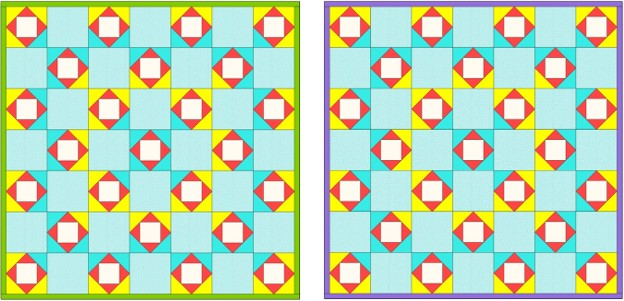
In this mockup, I played with green and purple as the bold or contrasting colors. If you think of a color wheel, green is opposite red and purple is opposite yellow. Since red and yellow are contrasting colors to green and purple, the green and purple binding make a high contrast – and a beautiful statement. In your quilt, determine what the contrasting colors are and see if you like the alternate colorway that a contrasting binding makes.
- Use a Color that is Bold in Your Quilt Binding
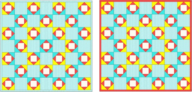
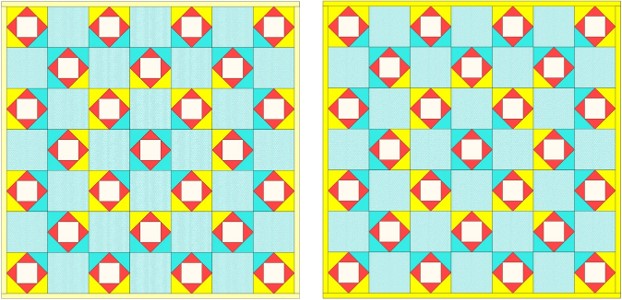
I played around below to show you two examples: the quilt on the left uses a light blue background fabric as the binding, and the quilt on the right uses a red binding. In the quilt on the left, you’ll feel your eyes slightly drift off the image as there’s nothing there to ground them…the binding blends right in. In the quilt on the right, the bold red creates the perfect frame around the quilt (spoiler alert: this is what I ended up going with).
- Use a Patterned Fabric in Your Quilt Binding
I love love the look of a striped binding, so I initially debated using a stripe in this quilt. There was so much already going on in this quilt, though, that I decided against it. In your quilt, consider a rainbow stripe or a timeless black and white stripe binding to create a lasting impression! - Use a Color that Highlights the Front *and* Back in Your Quilt Binding
So many of us create not just lovely fronts to our quilt, but lovely backs to our quilt, too. This brings us to our next point, which is to select a binding that compliments both the front *and* the back of the quilt. Perhaps you selected different fabrics for the back than the front; you can then choose a binding that looks equally beautiful on both sides. I have several yellow fabrics on my quilt back, so I played around with using a yellow border; the image on the left is a lighter yellow, and the one on the right has the darker yellow binding. Doesn’t it look so sunny?
- Make a Scrappy Binding
One of my favorite techniques for binding is to use scrap pieces to create a rainbow binding. In fact, I just used this technique to create the binding for the Jesse Tree Quilt, and I couldn’t be happier! Some quilts, especially those with repeating segments, look amazing with a binding that pops with color. For other quilts – especially those that are more abstract or non-linear, a solid binding will better encase the space and keep your eyes in the “frame” that the binding creates.
When it was all said and done, I went with the red. I loved how it made the quilt still feel like a gigantic tile, and how the binding served as a bold border. I’m off to cut and sew that binding, which means it’s your turn to share! What’s your TGIFF?


Love your different examples of how to select a binding.
Thanks, Gwyned! It completely changes the look of the quilt.